The art of Data Storytelling

Lately, the data community has been adopting tools and best practice from the software development world. Data storytelling is to data what user experience is to software, how the end user is exposed and interacting with what we produce. And we know that a very bad user experience is a blocker for software usage and adoption. While working at the South China Morning Post, I had the chance to work with world-class journalists that are experts in telling stories, so today I will share 8 tips I learned there to help you improve your data stories.
But before we start: why is it important?
If you are a data analyst, scientist or manager, you will have to communicate your insights and recommendations to stakeholders that might not have the same data literacy as you do. Surveys show that our brain tends to remember only 5% of numbers that are shared with us, versus 63% of a story we are being told. Numbers are cold facts, while stories are warm and emotional information we can relate to. Transforming your data into stories is essential to drive impact, and inspire actions. We don’t want our hard work to be left on a shelf, right?
So let’s jump into it!
Create impactful data stories
1. Is your story worth telling?
Not all analyses lead to interesting and actionable findings. Let’s face it, data does not have answers to all our questions. Either because we don’t have the data, the sample size is too small, due to tracking issues, biased datasets, [... fill the blank …]. Your stakeholder’s time is precious, and their attention span is very limited, so don’t feel compelled to communicate everything. By only sharing what matters, people will systematically listen carefully.
2. Building a strong narrative
Every analyses should be composed of:
- A business question to be answered, and potential hypotheses
- Some element of context
- The methodology used
- Couple of interesting insights, with sometimes unexpected ones
- Caveats or limitations in the interpretation
- Recommendations, actions to be taken
We have a natural tendency to frame the narrative around our thought process or in chronological order, describing one by one the steps of the analysis. While it is one option, there are in fact a dozen ways to structure a story.
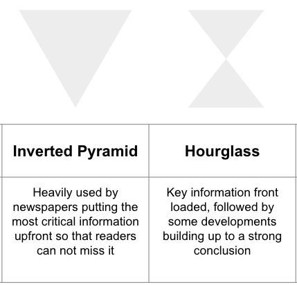
The 2 most impactful structures for Data Stories are:
- The inverted pyramid: Start with the most important information: your recommendation to the business, then explain why by sharing key insights, some elements of context and the initial business question. At the end, in the appendix, you can add caveats and the methodology.
- Hourglass (recommended): Start with the key and most surprising insight, then follow by why it is important, why we should pay attention, continue with other insights gathered during the analysis and conclude with the actions that need to be taken.
3. Adapt to the communication channel
Will you be presenting your findings via email? during a meeting? In a conference? on Slack? All communication channels have their own rules and specificities, make sure to use them to your advantage. Leverage formatting, titles, pictures, charts and/or animation when relevant.
Consider also the context of your presentation: Is it 5 minutes at the end of a 2-hour meeting? In that case you might want to be as concise as possible, going straight to the point and catching audience attention first with the most unexpected information, or asking for everyone’s attention for the next few minutes.
4. Introduce one new information at a time
On a slide, in a paragraph, or verbally, present 1 new complex concept at a time. You might lose your audience on the way otherwise.
5. Precision and accuracy are king
It happens that findings go against common beliefs and point towards different directions than where everybody is going. Stakeholders will leverage the smallest mistake (even if it does not impact the overall results) to discredit and disregard the analysis. Make sure to pay attention to details, be precise and accurate, and remove unnecessary information.
6. Use layman’s terms, not lingo or acronyms
Do not assume that everyone in the company understands the jargon or knows the metrics’ meaning. Prefer proper sentences and words than abbreviations.
7. Adapt to the audience. Who are you writing for?
Journalists write their articles having someone in mind. It helps them to structure the narrative and assess the level of details, context and explanation they need to provide. It is the same for your data stories:
- Are you communicating with your peers? your manager? A C-level? A new joiner in the company?
- Are they used to consume analysis? Are they familiar with the concepts?
- For peers make sure to spend some time on methodology and to share potential challenges faced along the process.
- For business counterparts, be action oriented and show evidence supporting your message. Be prepared to be challenged on the data interpretation.
- For C-levels, communicate concisely and focus on next actions
- For new joiners, don’t hesitate to over simplify, use comparisons or metaphors.
8. Data visualization, an ally? Not always
A graph catches the attention by its size, colors and shapes. It is a powerful weapon to convey an idea in a fraction of second. However, most of the time they are mis-used, too complex to read, not in line with the narrative. A chart should ease the understanding, not complexify it:
- Ensure that every chart has a clear purpose, if it is not the case remove it.
- Only show the information that is relevant. Unnecessary information may lead to more questions rather than bringing answers.
- Make sure to use the right graph: there is a plethora of options when it comes to chart types, but avoid any complex ones. Every visualization can be simplified with a line graph, vertical bar chart or horizontal bar chart.
- Use maximum two colors in the graph: a neutral one to display the data, the second one to highlight the key message
- The title should spell out the main information

For more tips on Data visualization check-out Evergreen data blog
Conclusion—and a last tip (peer review)
The last tip but probably the most important one: have your stories reviewed by a peer. In journalism, writing an article is a teamwork: the journalist is sourcing the information and writing the story, then the editor provides feedback, helps with the structure, corrects typos, removes unnecessary details or adds context. When working on an analysis, we lack distance with our work, so having a fresh perspective with a new pair of eyes is incredibly useful, so have someone to edit your work.
Here they are, 8 tips to create more compelling data stories. Most of those rules are common sense and we already know the theory behind them, but we often fail to apply them in practice, by lack of interest or time. Communicating properly analysis is critical to impact the business but building great data stories takes time and experience. So the more you practice the easier it will be over time!