Is tourism back to its pre-COVID-crisis level?

So it’s holiday season. Maybe you are the type of person — like myself — who spends every Christmas with their family. Or maybe you take the opportunity to travel the world during this time of the year?
No matter what type of holiday season traveler you are, chances are that you took some holidays this year and that you will take some more in 2023. Now that the worst (fingers crossed) of the COVID-19 crisis is over, have you wondered if tourism is back to its pre-crisis level?
This is a question I asked myself recently and I want to answer it — possibly for myself but also to shine in society during Christmas dinner. Beyond these considerations I find that conducting analyses on topics out of the strictly professional world is a good exercise to stay “in the game of data analytics”. Whether you are a junior or a more advanced data analyst, I find it always useful to train with new datasets outside of your daily job.
Let me take you on my journey to conducting an end-to-end analysis from the first thought until the final output!
Step 1: Find a relevant issue to tackle
In this article I want to take the opportunity to reflect on this year of travel and to investigate if tourism is back to its pre-crisis levels. This could be seen worldwide or the scope could be narrowed down to a restricted geographical area. As I live in Europe I am particularly interested in analyzing the impact of the COVID crisis on tourism in Europe.
Another axis of my thinking is: how do I measure “tourism”? This notion encapsulate various fields such as transportation (by plane, by train, by car…), touristic sites (museums, events…), accommodation (hotels, camping sites, home-stays…). To be more precise in the issue I want to analyze here, let’s focus on accommodation.
Step 2: Retrieve data to conduct your analysis
In the present case I don’t have company data or a predefined dataset available, so let’s browse the Internet to find some open data related to my topic.
Eurostat provides open datasets that can be visualized online and downloaded in several formats. Here I will use this dataset about the nights spent at tourist accommodation establishments.
Step 3: Draw your final output
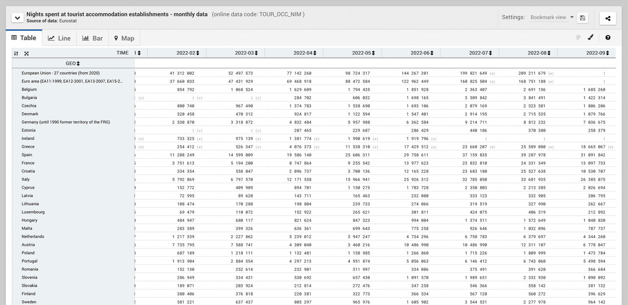
To answer my initial question I want to compare the global evolution of tourism in Europe with the evolution in each country. By doing so I should be able to see if, when and in which country tourism came back to its pre-crisis level.
To do so I will need two graphs: one displaying the total number of nights spent at tourist accommodation establishments per month, the second displaying the same metric split by country.
Step 4: Transform your data
With my raw dataset at hand (step 2) and my target output in mind (step 3), I am now all set to conduct the analysis. Did you notice that actually entering in “data analysis mode” comes at step 4 and not earlier? This is because analyzing data is much more about why you need to do that analysis than actually doing it.
To draw the first graph I must group the values (number of nights spent at tourist accommodation establishments) by month. For the second graph I must group by month and by country, as follows:
SELECT
    TIME_PERIOD AS month,
    geo AS country,
    SUM(obs_value) AS nb_nights_spent
FROM my_dataset.raw_data
GROUP BY month, country
ORDER BY month, country
Step 5: Visualize data
The output of code snippets are data tables, not (yet) graphs. To turn these tabular outputs into nice charts, let’s use a data visualization tool. Here I use the combination of Google BigQuery for step 4 and Looker Studio (previously known as DataStudio) for step 5.
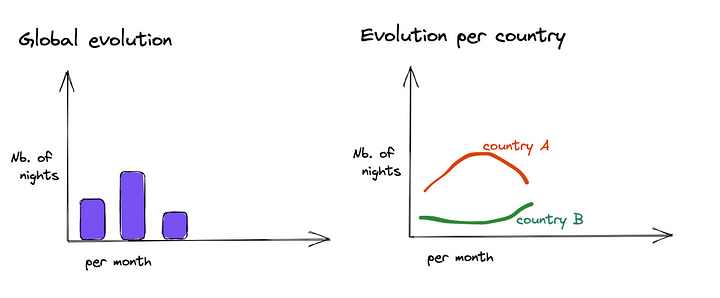
As we previously drew the target output, we already know how our final graphs should look like. This saves a lot of time here as I only have to configure the tool to put the right dimensions at the right place. This would give me these graphs:
Step 6: Draw insights
So what now? Building graphs is great, but without a human brain to interpret the resulting outputs it is rather useless. Let’s go back to our initial question: is tourism in Europe back to its pre-crisis level based on accommodation data? We want to provide an answer as clear as possible to this question.
If we look at the global evolution tourism in Europe seems to be back on track to reach its pre-crisis level. Although the 2022 summer seasons has not exactly reach the values of 2019 (-15% in July-August 2022 versus July-August 2019), the evolution is showing a positive trend compared to 2020 and 2021. It would be interesting to conduct the same analysis next year when the 2023 summer season is over.
If we have a closer look at the evolution of each country, this general comment does not always apply. For example Spain values in 2022 are very close to 2019 values (-4% only for July-August) while for others 2022 is far below 2019 (-26% in Czechia).
Conclusion
Another important element to have in mind when interpreting results concerns biases. First there could be biases in the way data is collected: as we compare different countries, each country may apply a different method to account for the number of nights spent at tourist accommodation establishments.
Second concluding that tourism is almost back to its pre-crisis level solely based on the analysis of one metric is necessarily partial. To be able to draw a fully accurate conclusion about the state of tourism in Europe, one should analyze several metrics, compare the results of these analyses and consolidate the lessons learned from them.
In short: when conducting an analysis take these 6 steps and beware of biases.